Toon® Solar
Overview
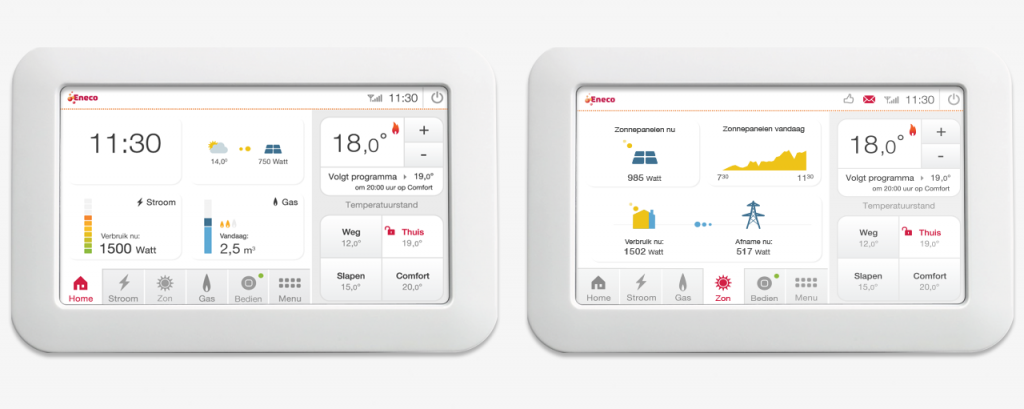
I started Zon op Toon with an elaborate user research. I wanted to find out what owners of solar panels would expect to be shown on Toon and how far the insight had to go. After the research I implemented as much knowledge as possible without losing track of the information architecture and clarity of the UI. Important features for Toon were the direct insight the moment the sun touches your solar panels and the elaborate graphs.
Zon op Toon was launched in 2014 and ported to the Toon mobile and tablet app, as well as display version 3.0.
Challenge
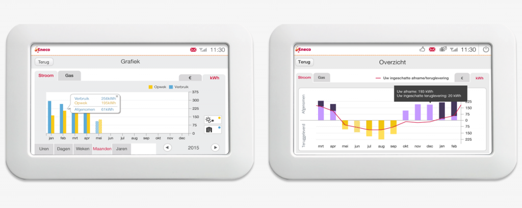
The depth of all required information, especially the graphs (production, usage and return of energy to the net. We discovered that our audience for this Solar feature are tech savvy, and demand detailed insight into their usage and production. What makes this a challenge is that our goal with Toon is to get less tech savvy people onboard in understanding energy, so how do you mix both audiences into Toon?
Solution
We decided to visualise the energy flow. Make visible what your solar panels are producing, see what your house is using and if you are putting produced energy in the grid or if you take from it, all in real time.
The upside of all of this is that you make it easier for the less tech savvy audience to understand how it all works and the tech savvy audience really wants to see and check the energy flow, and it confirms all is working (well). As a backup on the energy flow we provided detailed graphs about your usage and production.
User research
Personas
Customer Journey
User testing
Concepting
Interaction Design
Visual Design